Know More
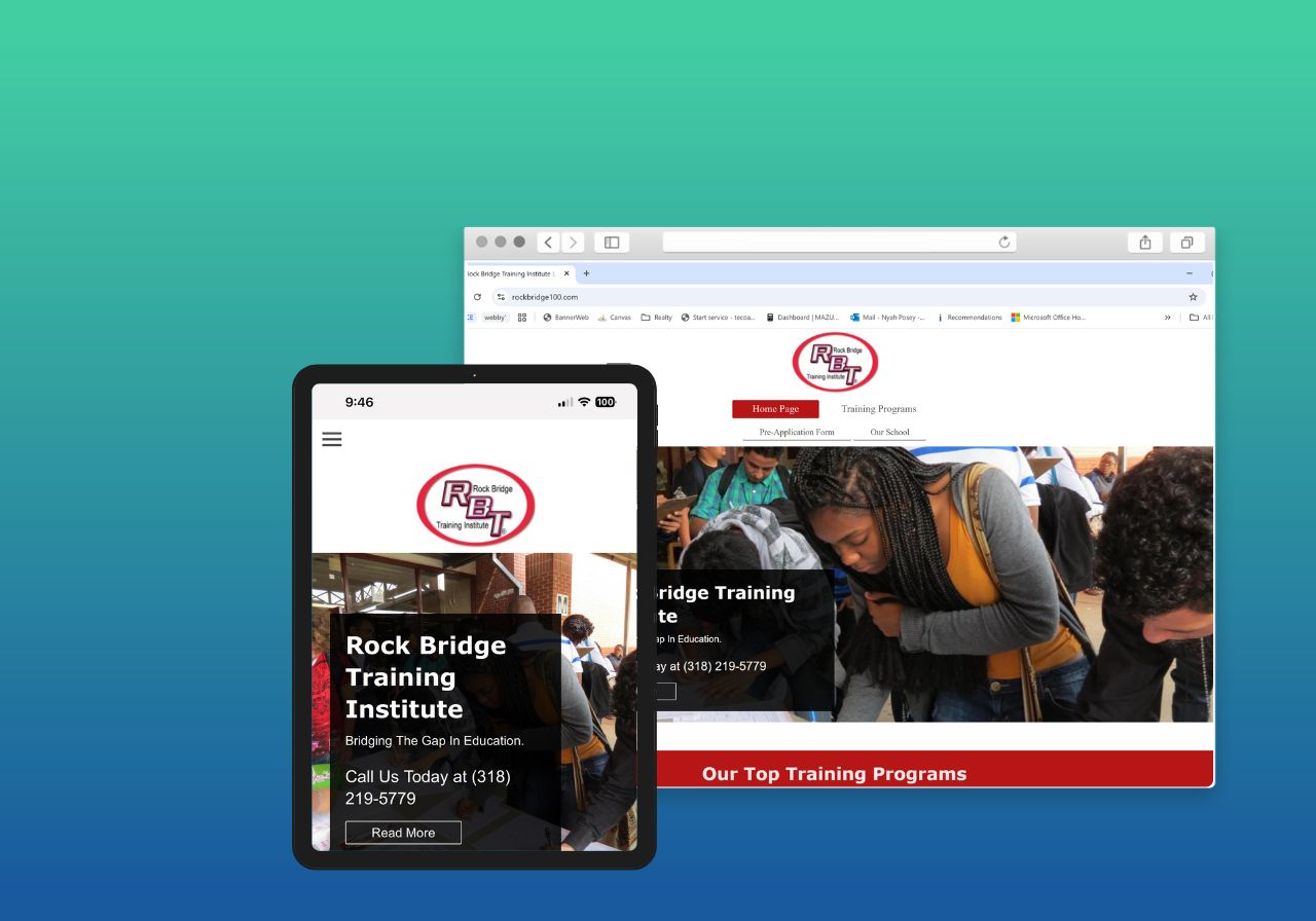
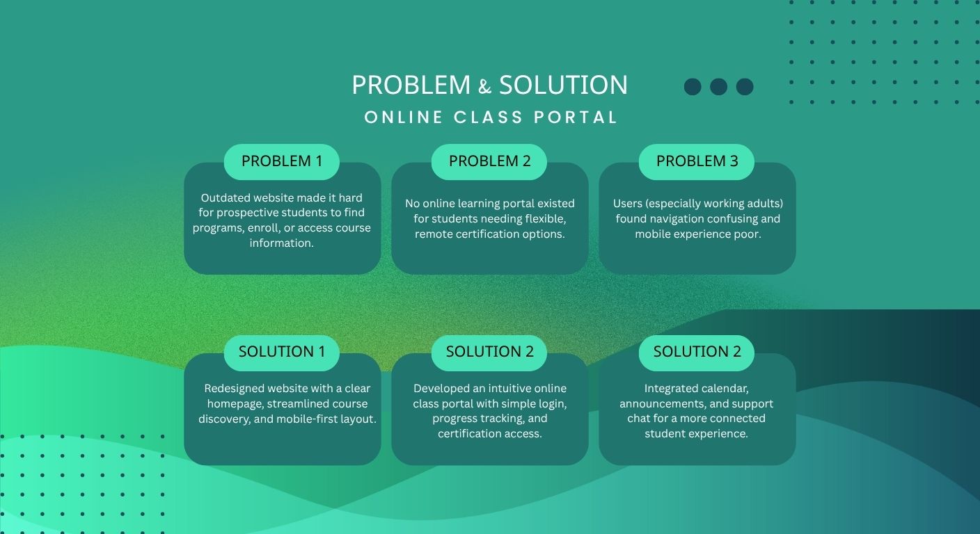
Rock Bridge Trade School offers career-focused certification programs in HVAC, welding, electrical systems, and more. While they offer excellent in-person training, the digital presence and online accessibility for remote learners were nearly nonexistent. With an outdated site and no self-paced or live virtual class options, they were losing potential students who needed remote learning flexibility due to work, family, or location constraints.
OVERVIEW
Objective: Design a web-responsive online learning portal that helps early-career professionals and career changers easily access short, skill-focused certification programs without needing to attend in person
Methods: Wireframing, Competitive Analysis, User Interviews & Surveys, Usability Testing, Preference Testing, Responsive Web Design, Interactive Prototyping
Role: UX Designer, Researcher
Tools: Figma, Notion, Procreate, Zoom, Google Forms
CHALLENGE
Designing for Real Life Schedules.
The challenge was to design an intuitive portal that enables users to search for the right classes based on their career goals and prior experience, all while accommodating learners who can’t attend in person due to work or life demands. The experience needed to be simple, efficient, and motivational.
HYPOTHESIS
Helping Users Take the Next Step—Fast.
We believe that busy, goal-driven learners need quick, clear, and trusted access to the skills and certifications employers are looking for. By using this Online Class Portal, users can easily find the most relevant classes based on their career path, making it easier to plan their learning, feel confident, and take action.
We’ll validate this hypothesis by tracking how frequently users engage with the portal—measured by the number of class enrollments, course views, and saved certifications per month.
SOLOUTION
Your All-in-One Portal for Career-Ready Certifications.
The Online Class Portal offers a personalized, streamlined experience for learners looking to gain new certifications, upskill, or pivot careers. With real-time course recommendations, career-aligned pathways, and user-friendly design, it puts learners in control of their professional development—from anywhere.
SOLUTION 01
Smarter Course Discovery
Tired of endless course catalogs that don’t apply to your career path? The portal recommends classes based on your experience, role, and industry, helping you skip the guesswork and get straight to the learning that moves you forward.
SOLUTION 02
Clear, Practical Information You Can Trust
Forget jargon or vague class descriptions. Each course comes with easy-to-understand overviews, certification outcomes, skill levels, and learning formats—so whether you’re a beginner or advanced, you know exactly what you’re signing up for.
SOLUTION 03
Tailored to Your Skill Level and Goals
Looking for an entry-level electrical training program? Or advanced HVAC certification? With robust filters, the portal helps you narrow classes by trade, level, duration, and learning style—so you always get the right match.
A Closer Look at Our Learners and Their Needs
USER RESEARCH
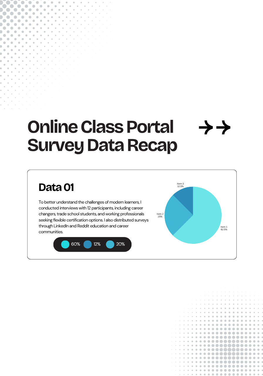
To better understand the challenges of modern learners, I conducted interviews with 12 participants, including career changers, trade school students, and working professionals seeking flexible certification options. I also distributed surveys through LinkedIn and Reddit education and career communities.
Key Findings:
80% of users felt overwhelmed or unsure when trying to find the right course or certification for their career goals.
90% preferred visually organized course listings with filters and structure over dense catalogs or text-heavy lists.
Participants requested clear difficulty levels, certification value indicators, and cleaner, more intuitive UI for faster navigation and decision-making.
Using the rainbow spreadsheet method, I categorized feedback and applied Jakob Nielsen’s severity ratings to prioritize friction points. Key enhancements included:
Improved visual hierarchy of course cards
Streamlined save-to-profile flow
Added “quick view” of certification pathways
These insights directly informed the next design iteration, enhancing usability and supporting learners’ confidence in navigating the platform.
IDEATION
Turning Pain Points Into Purposeful Features
The Online Class Portal was designed to address the most common frustrations faced by busy learners, career changers, and certification-seeking professionals. Through wireframing, prototyping, and testing, three key features emerged to improve course discovery and usability.
Course Finder
Quickly discover high-impact certification courses based on job level, trade focus, or career path—no more digging through outdated or irrelevant catalogs.
Smart Filters & Categories
Easily refine search results by trade, experience level, certification type, or learning style (e.g., self-paced vs. live), ensuring every course shown is aligned with user goals.
Learning Pathways
Structured course recommendations show how one certification leads to another, helping learners see their progress and plan next steps with clarity and confidence.
USER RESEARCH
User Persona
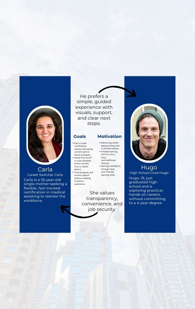
To guide the design decisions, we created two primary user personas based on user research: Career Switcher Carla and High School Grad Hugo. Carla is a 35-year-old single mother seeking a flexible, fast-tracked certification in medical assisting to reenter the workforce. She values transparency, convenience, and job security. Hugo, 19, just graduated high school and is exploring practical, hands-on careers without committing to a 4-year degree. He prefers a simple, guided experience with visuals, support, and clear next steps. These personas helped ensure that our solutions addressed the goals, motivations, and limitations of our diverse target audience.
Design Improvements Backed by Data
Using the rainbow spreadsheet method, I categorized feedback and applied Jakob Nielsen’s severity ratings to prioritize friction points. Key enhancements included:
Improved visual hierarchy of course cards
Streamlined save-to-profile flow
Added “quick view” of certification pathways
These insights directly informed the next design iteration, enhancing usability and supporting learners’ confidence in navigating the platform.
Low-Fidelity Wireframes
I created a set of low-fidelity wireframes to visualize core user flows and test layout ideas without the distraction of detailed visuals. Key wireframes included the homepage, course detail page, enrollment form, and student dashboard. These wireframes emphasized clarity and simplicity, incorporating features like a course filter, call-to-action buttons, and progress indicators. User flow mapping allowed us to ensure that each step—discovery, course selection, enrollment, and learning—was intuitive and linear. These sketches were reviewed by stakeholders and tested with users in early usability sessions, helping to validate core layout decisions before investing in high-fidelity design.
Mid-Fidelity Wireframes
Building on the initial sketches, I developed mid-fidelity wireframes to refine layout structure, introduce defined UI components, and apply concise, clear copy. Visual hierarchy, spacing, and grid alignment were carefully considered to enhance usability and focus user attention on key interactions.
Key User Flows:
Browse > Course Page > Enrollment > Payment > Student Dashboard
Returning User > Dashboard > Class Access > Certification Download
Usability Test
After developing a functional prototype in Figma, we conducted remote usability tests with 10 participants representing our target personas. Participants were asked to complete core tasks like finding a course, enrolling, and navigating the dashboard. The tests revealed that users responded well to the streamlined enrollment funnel and appreciated real-time support features. Some confusion around pricing clarity and course comparisons led us to further refine those sections. We measured success through metrics such as task completion rate, time on task, and user satisfaction scores. The usability tests confirmed that our design improved comprehension and conversion, validating key UX decisions made throughout the process.
Time to find and enroll in a course: Down 45% (Avg 2 min → 1.1 min)
Task completion (Enroll): 9/10
User Satisfaction (SUS Score): 84/100 (was 59 pre-redesign)
Mid-Fidelity Wireframes
Building on the initial sketches, I developed mid-fidelity wireframes to refine layout structure, introduce defined UI components, and apply concise, clear copy. Visual hierarchy, spacing, and grid alignment were carefully considered to enhance usability and focus user attention on key interactions.
Key User Flows:
Browse > Course Page > Enrollment > Payment > Student Dashboard
Returning User > Dashboard > Class Access > Certification Download
KEY UX INSIGHTS – ONLINE LEARNING MADE ACCESSIBLE
Designing the online class portal for Rock Bridge Training Institute was a deeply impactful project, bridging traditional trade education with modern digital accessibility. This project emphasized the importance of user-centered content hierarchy, transparent navigation, and designing for confidence-building. Aligning UX decisions with stakeholder goals ensured that both administrative needs and student experiences were addressed holistically. Ultimately, the project reinforced how thoughtful UX can democratize education and open new career pathways for underserved audiences.
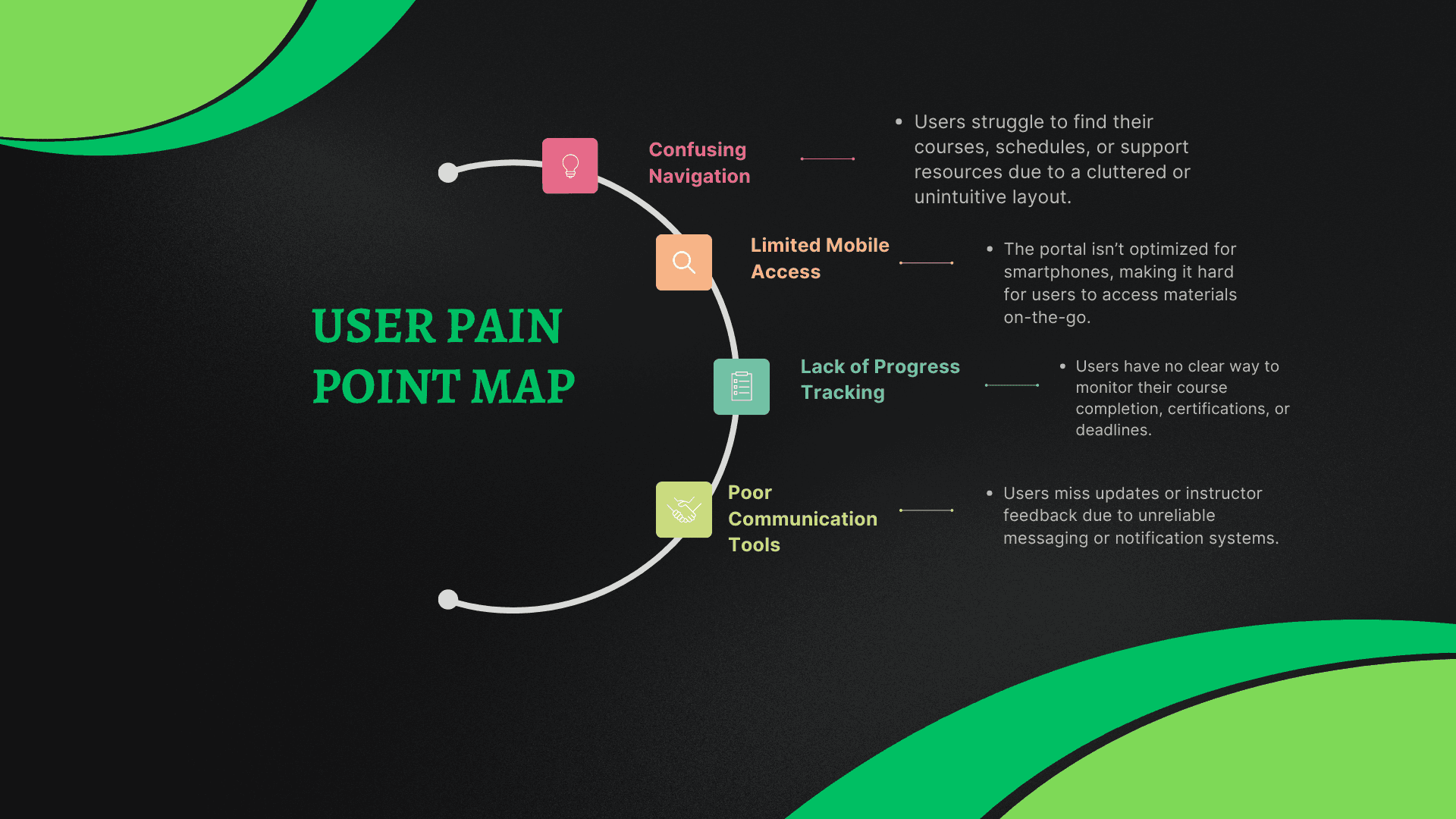
Users want simple, mobile-friendly navigation with clear course info (pricing, outcomes, time commitment).
Trust and credibility are crucial—students look for accreditation, job prospects, and testimonials.
Quick, frictionless enrollment is essential, especially for career switchers and adult learners.
Aligning UX with both student needs and admin workflows created a balanced, effective design.
NEXT STEPS
If given more time the next phase of the project would focus on comprehensive usability testing with real users—particularly those representative of the school’s target demographics. These tests will help validate user flows for course discovery, enrollment, and in-dashboard learning interactions. Special attention will be paid to mobile usage, accessibility needs, and the clarity of course value propositions.
Prioritize improvements in mobile experience, course comparison, and support tools (e.g. live chat).
Build out personalized dashboards and begin integrating job placement support.
Add analytics tools for instructors/admins to track course progress and engagement.
More Works


FAQ
01
What does a project look like?
02
What services do you offer as a UX/UI designer?
03
What industries do you have experience designing for?
04
Do you work with clients remotely?
05
What tools do you use for design?
06
Can you help redesign an existing product or app?
07
How long does a typical project take?
08
Are you currently available for new projects?
Know More
Rock Bridge Trade School offers career-focused certification programs in HVAC, welding, electrical systems, and more. While they offer excellent in-person training, the digital presence and online accessibility for remote learners were nearly nonexistent. With an outdated site and no self-paced or live virtual class options, they were losing potential students who needed remote learning flexibility due to work, family, or location constraints.
OVERVIEW
Objective: Design a web-responsive online learning portal that helps early-career professionals and career changers easily access short, skill-focused certification programs without needing to attend in person
Methods: Wireframing, Competitive Analysis, User Interviews & Surveys, Usability Testing, Preference Testing, Responsive Web Design, Interactive Prototyping
Role: UX Designer, Researcher
Tools: Figma, Notion, Procreate, Zoom, Google Forms
CHALLENGE
Designing for Real Life Schedules.
The challenge was to design an intuitive portal that enables users to search for the right classes based on their career goals and prior experience, all while accommodating learners who can’t attend in person due to work or life demands. The experience needed to be simple, efficient, and motivational.
HYPOTHESIS
Helping Users Take the Next Step—Fast.
We believe that busy, goal-driven learners need quick, clear, and trusted access to the skills and certifications employers are looking for. By using this Online Class Portal, users can easily find the most relevant classes based on their career path, making it easier to plan their learning, feel confident, and take action.
We’ll validate this hypothesis by tracking how frequently users engage with the portal—measured by the number of class enrollments, course views, and saved certifications per month.
SOLOUTION
Your All-in-One Portal for Career-Ready Certifications.
The Online Class Portal offers a personalized, streamlined experience for learners looking to gain new certifications, upskill, or pivot careers. With real-time course recommendations, career-aligned pathways, and user-friendly design, it puts learners in control of their professional development—from anywhere.
SOLUTION 01
Smarter Course Discovery
Tired of endless course catalogs that don’t apply to your career path? The portal recommends classes based on your experience, role, and industry, helping you skip the guesswork and get straight to the learning that moves you forward.
SOLUTION 02
Clear, Practical Information You Can Trust
Forget jargon or vague class descriptions. Each course comes with easy-to-understand overviews, certification outcomes, skill levels, and learning formats—so whether you’re a beginner or advanced, you know exactly what you’re signing up for.
SOLUTION 03
Tailored to Your Skill Level and Goals
Looking for an entry-level electrical training program? Or advanced HVAC certification? With robust filters, the portal helps you narrow classes by trade, level, duration, and learning style—so you always get the right match.
A Closer Look at Our Learners and Their Needs
USER RESEARCH
To better understand the challenges of modern learners, I conducted interviews with 12 participants, including career changers, trade school students, and working professionals seeking flexible certification options. I also distributed surveys through LinkedIn and Reddit education and career communities.
Key Findings:
80% of users felt overwhelmed or unsure when trying to find the right course or certification for their career goals.
90% preferred visually organized course listings with filters and structure over dense catalogs or text-heavy lists.
Participants requested clear difficulty levels, certification value indicators, and cleaner, more intuitive UI for faster navigation and decision-making.
Using the rainbow spreadsheet method, I categorized feedback and applied Jakob Nielsen’s severity ratings to prioritize friction points. Key enhancements included:
Improved visual hierarchy of course cards
Streamlined save-to-profile flow
Added “quick view” of certification pathways
These insights directly informed the next design iteration, enhancing usability and supporting learners’ confidence in navigating the platform.
IDEATION
Turning Pain Points Into Purposeful Features
The Online Class Portal was designed to address the most common frustrations faced by busy learners, career changers, and certification-seeking professionals. Through wireframing, prototyping, and testing, three key features emerged to improve course discovery and usability.
Course Finder
Quickly discover high-impact certification courses based on job level, trade focus, or career path—no more digging through outdated or irrelevant catalogs.
Smart Filters & Categories
Easily refine search results by trade, experience level, certification type, or learning style (e.g., self-paced vs. live), ensuring every course shown is aligned with user goals.
Learning Pathways
Structured course recommendations show how one certification leads to another, helping learners see their progress and plan next steps with clarity and confidence.
USER RESEARCH
User Persona
To guide the design decisions, we created two primary user personas based on user research: Career Switcher Carla and High School Grad Hugo. Carla is a 35-year-old single mother seeking a flexible, fast-tracked certification in medical assisting to reenter the workforce. She values transparency, convenience, and job security. Hugo, 19, just graduated high school and is exploring practical, hands-on careers without committing to a 4-year degree. He prefers a simple, guided experience with visuals, support, and clear next steps. These personas helped ensure that our solutions addressed the goals, motivations, and limitations of our diverse target audience.
Design Improvements Backed by Data
Using the rainbow spreadsheet method, I categorized feedback and applied Jakob Nielsen’s severity ratings to prioritize friction points. Key enhancements included:
Improved visual hierarchy of course cards
Streamlined save-to-profile flow
Added “quick view” of certification pathways
These insights directly informed the next design iteration, enhancing usability and supporting learners’ confidence in navigating the platform.
Low-Fidelity Wireframes
I created a set of low-fidelity wireframes to visualize core user flows and test layout ideas without the distraction of detailed visuals. Key wireframes included the homepage, course detail page, enrollment form, and student dashboard. These wireframes emphasized clarity and simplicity, incorporating features like a course filter, call-to-action buttons, and progress indicators. User flow mapping allowed us to ensure that each step—discovery, course selection, enrollment, and learning—was intuitive and linear. These sketches were reviewed by stakeholders and tested with users in early usability sessions, helping to validate core layout decisions before investing in high-fidelity design.
Mid-Fidelity Wireframes
Building on the initial sketches, I developed mid-fidelity wireframes to refine layout structure, introduce defined UI components, and apply concise, clear copy. Visual hierarchy, spacing, and grid alignment were carefully considered to enhance usability and focus user attention on key interactions.
Key User Flows:
Browse > Course Page > Enrollment > Payment > Student Dashboard
Returning User > Dashboard > Class Access > Certification Download
Usability Test
After developing a functional prototype in Figma, we conducted remote usability tests with 10 participants representing our target personas. Participants were asked to complete core tasks like finding a course, enrolling, and navigating the dashboard. The tests revealed that users responded well to the streamlined enrollment funnel and appreciated real-time support features. Some confusion around pricing clarity and course comparisons led us to further refine those sections. We measured success through metrics such as task completion rate, time on task, and user satisfaction scores. The usability tests confirmed that our design improved comprehension and conversion, validating key UX decisions made throughout the process.
Time to find and enroll in a course: Down 45% (Avg 2 min → 1.1 min)
Task completion (Enroll): 9/10
User Satisfaction (SUS Score): 84/100 (was 59 pre-redesign)
KEY UX INSIGHTS – ONLINE LEARNING MADE ACCESSIBLE
Designing the online class portal for Rock Bridge Training Institute was a deeply impactful project, bridging traditional trade education with modern digital accessibility. This project emphasized the importance of user-centered content hierarchy, transparent navigation, and designing for confidence-building. Aligning UX decisions with stakeholder goals ensured that both administrative needs and student experiences were addressed holistically. Ultimately, the project reinforced how thoughtful UX can democratize education and open new career pathways for underserved audiences.
Users want simple, mobile-friendly navigation with clear course info (pricing, outcomes, time commitment).
Trust and credibility are crucial—students look for accreditation, job prospects, and testimonials.
Quick, frictionless enrollment is essential, especially for career switchers and adult learners.
Aligning UX with both student needs and admin workflows created a balanced, effective design.
NEXT STEPS
If given more time the next phase of the project would focus on comprehensive usability testing with real users—particularly those representative of the school’s target demographics. These tests will help validate user flows for course discovery, enrollment, and in-dashboard learning interactions. Special attention will be paid to mobile usage, accessibility needs, and the clarity of course value propositions.
Prioritize improvements in mobile experience, course comparison, and support tools (e.g. live chat).
Build out personalized dashboards and begin integrating job placement support.
Add analytics tools for instructors/admins to track course progress and engagement.
More Works
FAQ
01
What does a project look like?
02
What services do you offer as a UX/UI designer?
03
What industries do you have experience designing for?
04
Do you work with clients remotely?
05
What tools do you use for design?
06
Can you help redesign an existing product or app?
07
How long does a typical project take?
08
Are you currently available for new projects?
Know More
Rock Bridge Trade School offers career-focused certification programs in HVAC, welding, electrical systems, and more. While they offer excellent in-person training, the digital presence and online accessibility for remote learners were nearly nonexistent. With an outdated site and no self-paced or live virtual class options, they were losing potential students who needed remote learning flexibility due to work, family, or location constraints.
OVERVIEW
Objective: Design a web-responsive online learning portal that helps early-career professionals and career changers easily access short, skill-focused certification programs without needing to attend in person
Methods: Wireframing, Competitive Analysis, User Interviews & Surveys, Usability Testing, Preference Testing, Responsive Web Design, Interactive Prototyping
Role: UX Designer, Researcher
Tools: Figma, Notion, Procreate, Zoom, Google Forms
CHALLENGE
Designing for Real Life Schedules.
The challenge was to design an intuitive portal that enables users to search for the right classes based on their career goals and prior experience, all while accommodating learners who can’t attend in person due to work or life demands. The experience needed to be simple, efficient, and motivational.
HYPOTHESIS
Helping Users Take the Next Step—Fast.
We believe that busy, goal-driven learners need quick, clear, and trusted access to the skills and certifications employers are looking for. By using this Online Class Portal, users can easily find the most relevant classes based on their career path, making it easier to plan their learning, feel confident, and take action.
We’ll validate this hypothesis by tracking how frequently users engage with the portal—measured by the number of class enrollments, course views, and saved certifications per month.
SOLOUTION
Your All-in-One Portal for Career-Ready Certifications.
The Online Class Portal offers a personalized, streamlined experience for learners looking to gain new certifications, upskill, or pivot careers. With real-time course recommendations, career-aligned pathways, and user-friendly design, it puts learners in control of their professional development—from anywhere.
SOLUTION 01
Smarter Course Discovery
Tired of endless course catalogs that don’t apply to your career path? The portal recommends classes based on your experience, role, and industry, helping you skip the guesswork and get straight to the learning that moves you forward.
SOLUTION 02
Clear, Practical Information You Can Trust
Forget jargon or vague class descriptions. Each course comes with easy-to-understand overviews, certification outcomes, skill levels, and learning formats—so whether you’re a beginner or advanced, you know exactly what you’re signing up for.
SOLUTION 03
Tailored to Your Skill Level and Goals
Looking for an entry-level electrical training program? Or advanced HVAC certification? With robust filters, the portal helps you narrow classes by trade, level, duration, and learning style—so you always get the right match.
A Closer Look at Our Learners and Their Needs
USER RESEARCH
To better understand the challenges of modern learners, I conducted interviews with 12 participants, including career changers, trade school students, and working professionals seeking flexible certification options. I also distributed surveys through LinkedIn and Reddit education and career communities.
Key Findings:
80% of users felt overwhelmed or unsure when trying to find the right course or certification for their career goals.
90% preferred visually organized course listings with filters and structure over dense catalogs or text-heavy lists.
Participants requested clear difficulty levels, certification value indicators, and cleaner, more intuitive UI for faster navigation and decision-making.
IDEATION
Turning Pain Points Into Purposeful Features
The Online Class Portal was designed to address the most common frustrations faced by busy learners, career changers, and certification-seeking professionals. Through wireframing, prototyping, and testing, three key features emerged to improve course discovery and usability.
Course Finder
Quickly discover high-impact certification courses based on job level, trade focus, or career path—no more digging through outdated or irrelevant catalogs.
Smart Filters & Categories
Easily refine search results by trade, experience level, certification type, or learning style (e.g., self-paced vs. live), ensuring every course shown is aligned with user goals.
Learning Pathways
Structured course recommendations show how one certification leads to another, helping learners see their progress and plan next steps with clarity and confidence.
USER RESEARCH
User Persona
To guide the design decisions, we created two primary user personas based on user research: Career Switcher Carla and High School Grad Hugo. Carla is a 35-year-old single mother seeking a flexible, fast-tracked certification in medical assisting to reenter the workforce. She values transparency, convenience, and job security. Hugo, 19, just graduated high school and is exploring practical, hands-on careers without committing to a 4-year degree. He prefers a simple, guided experience with visuals, support, and clear next steps. These personas helped ensure that our solutions addressed the goals, motivations, and limitations of our diverse target audience.
Design Improvements Backed by Data
Using the rainbow spreadsheet method, I categorized feedback and applied Jakob Nielsen’s severity ratings to prioritize friction points. Key enhancements included:
Improved visual hierarchy of course cards
Streamlined save-to-profile flow
Added “quick view” of certification pathways
These insights directly informed the next design iteration, enhancing usability and supporting learners’ confidence in navigating the platform.
Low-Fidelity Wireframes
I created a set of low-fidelity wireframes to visualize core user flows and test layout ideas without the distraction of detailed visuals. Key wireframes included the homepage, course detail page, enrollment form, and student dashboard. These wireframes emphasized clarity and simplicity, incorporating features like a course filter, call-to-action buttons, and progress indicators. User flow mapping allowed us to ensure that each step—discovery, course selection, enrollment, and learning—was intuitive and linear. These sketches were reviewed by stakeholders and tested with users in early usability sessions, helping to validate core layout decisions before investing in high-fidelity design.
Mid-Fidelity Wireframes
Building on the initial sketches, I developed mid-fidelity wireframes to refine layout structure, introduce defined UI components, and apply concise, clear copy. Visual hierarchy, spacing, and grid alignment were carefully considered to enhance usability and focus user attention on key interactions.
Key User Flows:
Browse > Course Page > Enrollment > Payment > Student Dashboard
Returning User > Dashboard > Class Access > Certification Download
Usability Test
After developing a functional prototype in Figma, we conducted remote usability tests with 10 participants representing our target personas. Participants were asked to complete core tasks like finding a course, enrolling, and navigating the dashboard. The tests revealed that users responded well to the streamlined enrollment funnel and appreciated real-time support features. Some confusion around pricing clarity and course comparisons led us to further refine those sections. We measured success through metrics such as task completion rate, time on task, and user satisfaction scores. The usability tests confirmed that our design improved comprehension and conversion, validating key UX decisions made throughout the process.
Time to find and enroll in a course: Down 45% (Avg 2 min → 1.1 min)
Task completion (Enroll): 9/10
User Satisfaction (SUS Score): 84/100 (was 59 pre-redesign)
KEY UX INSIGHTS – ONLINE LEARNING MADE ACCESSIBLE
Designing the online class portal for Rock Bridge Training Institute was a deeply impactful project, bridging traditional trade education with modern digital accessibility. This project emphasized the importance of user-centered content hierarchy, transparent navigation, and designing for confidence-building. Aligning UX decisions with stakeholder goals ensured that both administrative needs and student experiences were addressed holistically. Ultimately, the project reinforced how thoughtful UX can democratize education and open new career pathways for underserved audiences.
Users want simple, mobile-friendly navigation with clear course info (pricing, outcomes, time commitment).
Trust and credibility are crucial—students look for accreditation, job prospects, and testimonials.
Quick, frictionless enrollment is essential, especially for career switchers and adult learners.
Aligning UX with both student needs and admin workflows created a balanced, effective design.
NEXT STEPS
If given more time the next phase of the project would focus on comprehensive usability testing with real users—particularly those representative of the school’s target demographics. These tests will help validate user flows for course discovery, enrollment, and in-dashboard learning interactions. Special attention will be paid to mobile usage, accessibility needs, and the clarity of course value propositions.
Prioritize improvements in mobile experience, course comparison, and support tools (e.g. live chat).
Build out personalized dashboards and begin integrating job placement support.
Add analytics tools for instructors/admins to track course progress and engagement.
More Works
FAQ
What does a project look like?
What services do you offer as a UX/UI designer?
What industries do you have experience designing for?
Do you work with clients remotely?
What tools do you use for design?
Can you help redesign an existing product or app?
How long does a typical project take?
Are you currently available for new projects?